Enhancing trust in remote medical consultations

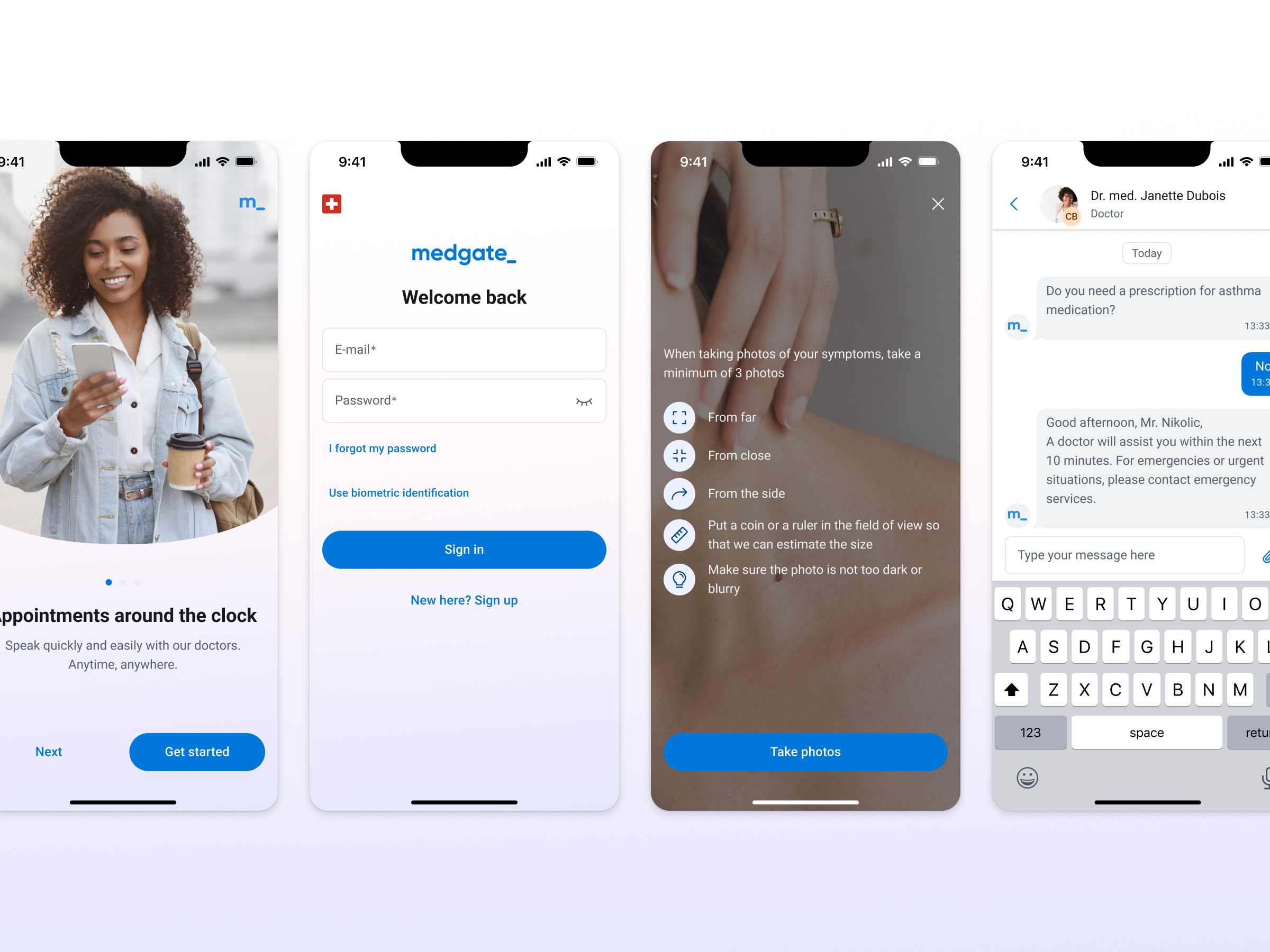
For more than two decades, Medgate has provided remote doctor visits. Initially conducted exclusively via telephone, these consultations can now be held through a mobile application. When it comes to the patient-physician relationship trust plays a crucial role. How can digital touchpoints cultivate a trustful bond between patients and physicians?

Company
Medgate

Year
October 2022 – now

Role & team
Leading designer and design system manager, working with POs and a freelance designer

Fostering trust through stable UI design

When it comes to the delivery of purely remote services, user interfaces assume the role traditionally occupied by physical spaces. Just as a neglected doctor's office with a dirty floor or peeling paint can create discomfort, a carelessly designed app can evoke similar impressions. Moreover, given that healthcare IT manages the most sensitive patient data, it becomes paramount for digital touchpoints to convey an aura of trustworthiness.

In 2022, I became Medgate's first in-house designer, replacing the previous reliance on short-term engagements of external consultants for design work. Despite some signs of a design system, the app's UI suffered from inconsistency due to the inconsistent investment in design.

My primary objective was to stabilize the design system and elevate the app to a new standard of professionalism.

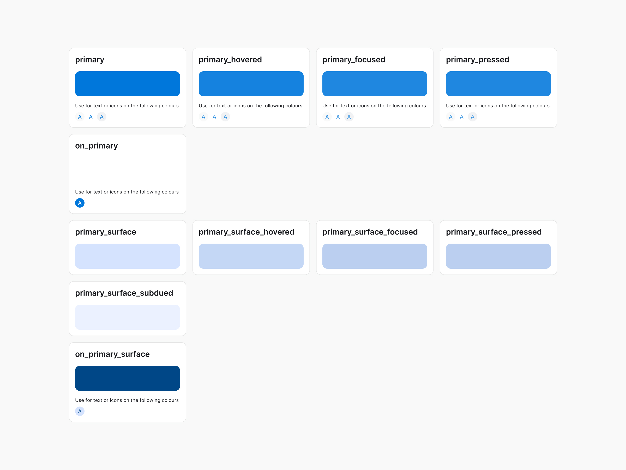
An accessible colour palette optimized for multi-brand-use

Previously, the color system consisted of various scales made of tints and shades with non-descriptive names. The colors were used inconsistently and several of the color values didn't fulfill accessibility standards.

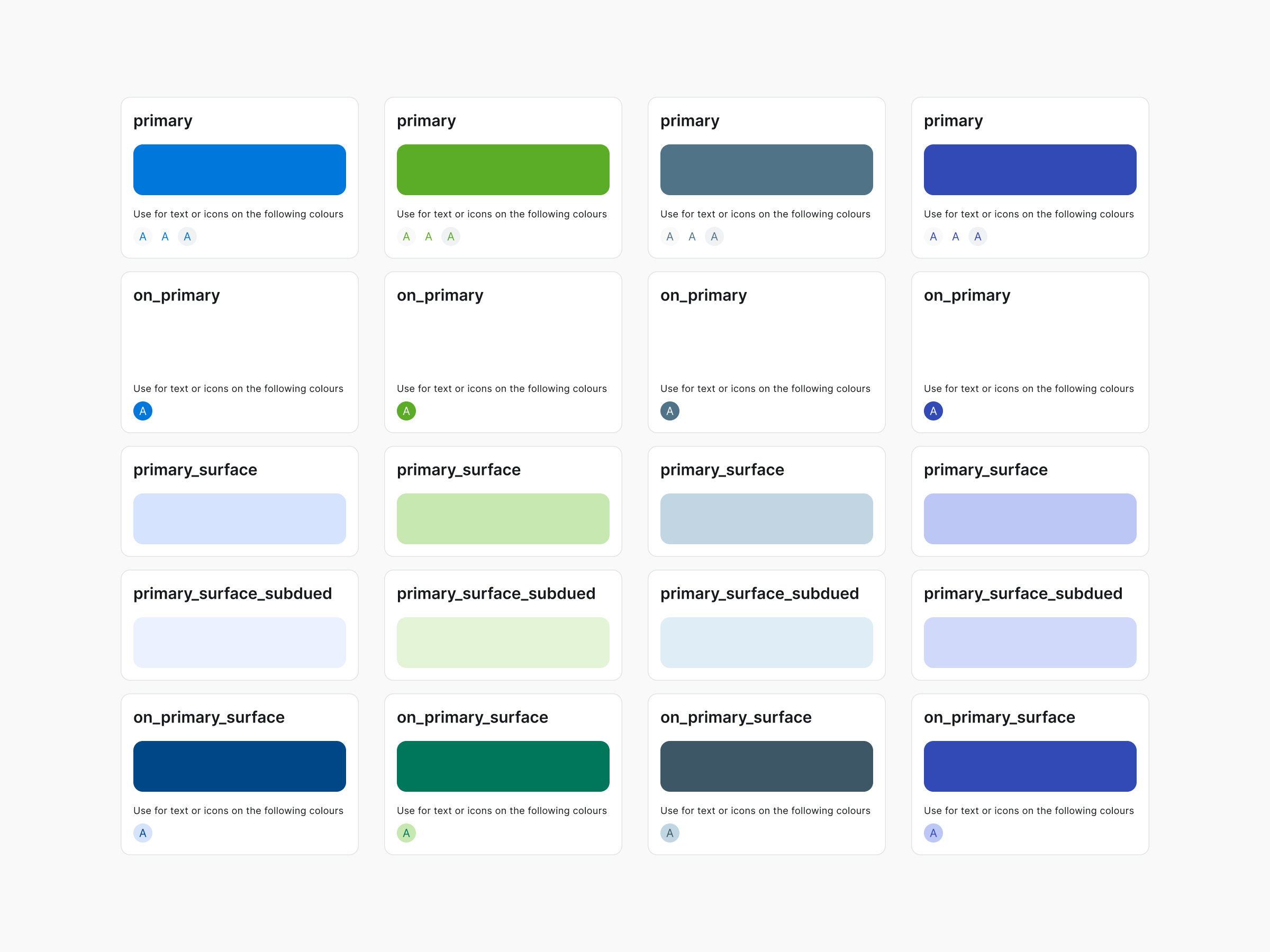
Furthermore, the Medgate app is published in four different brand versions, one in the Medgate branding and three for partnering health insurance companies. Previously, colors were manually swapped for each brand on a per-screen basis, leading to implementation errors and a time-consuming process for both designers and developers.

I revised the color system to achieve the following benefits:

  • Accessible color palettes: The slightly adjusted color values are more vibrant and fulfill accessibility requirements.
  • Semantic color tokens: Descriptive names reflect the intended use of colors and simplify communication with development.
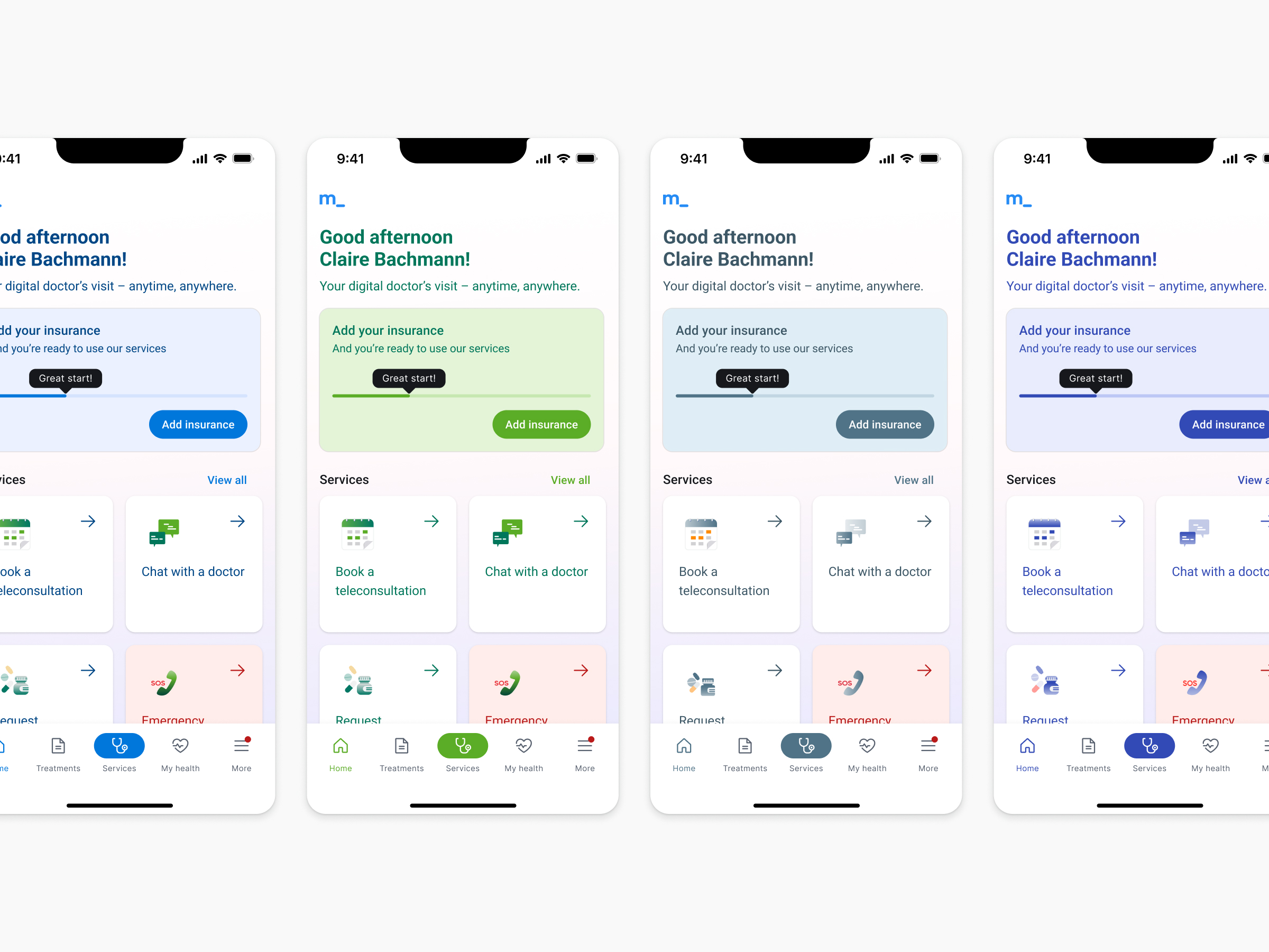
  • Streamlined branding: To optimize efficiency, only the primary color will be swapped for each brand. This decision, combined with Figma's new variable feature, significantly reduces the effort for the creation of visual assets (like app store screens) and development.

Streamlined icons for a professional look

Previously, icons came from different sets or were individually customized, resulting in a mismatched set characterized by varying line thicknesses and levels of detail. To address these issues, we've introduced a new icon set combining phosphor icons and Google Material icons.

Consistent language across the patient journey

Marketing professionals, translators, content creators for educational materials, and medical experts all play a role in generating text content at Medgate. However, this diverse input often resulted in inconsistencies in wording across the patient journey. To address this issue, I've developed a comprehensive glossary to be utilized company-wide. The new glossary offers several advantages:

  • Consistent wording throughout the patient journey: By ensuring uniform terminology across various touchpoints such as emails and apps, the glossary enhances coherence in communication.
  • Target-specific language: Our glossary meticulously documents medical terms alongside their patient-friendly equivalents, facilitating clearer and more accessible communication.
  • Efficient translation workflows: Through integration with Phrase, our localization tool, the glossary has significantly streamlined translation processes compared to our previous manual methods.

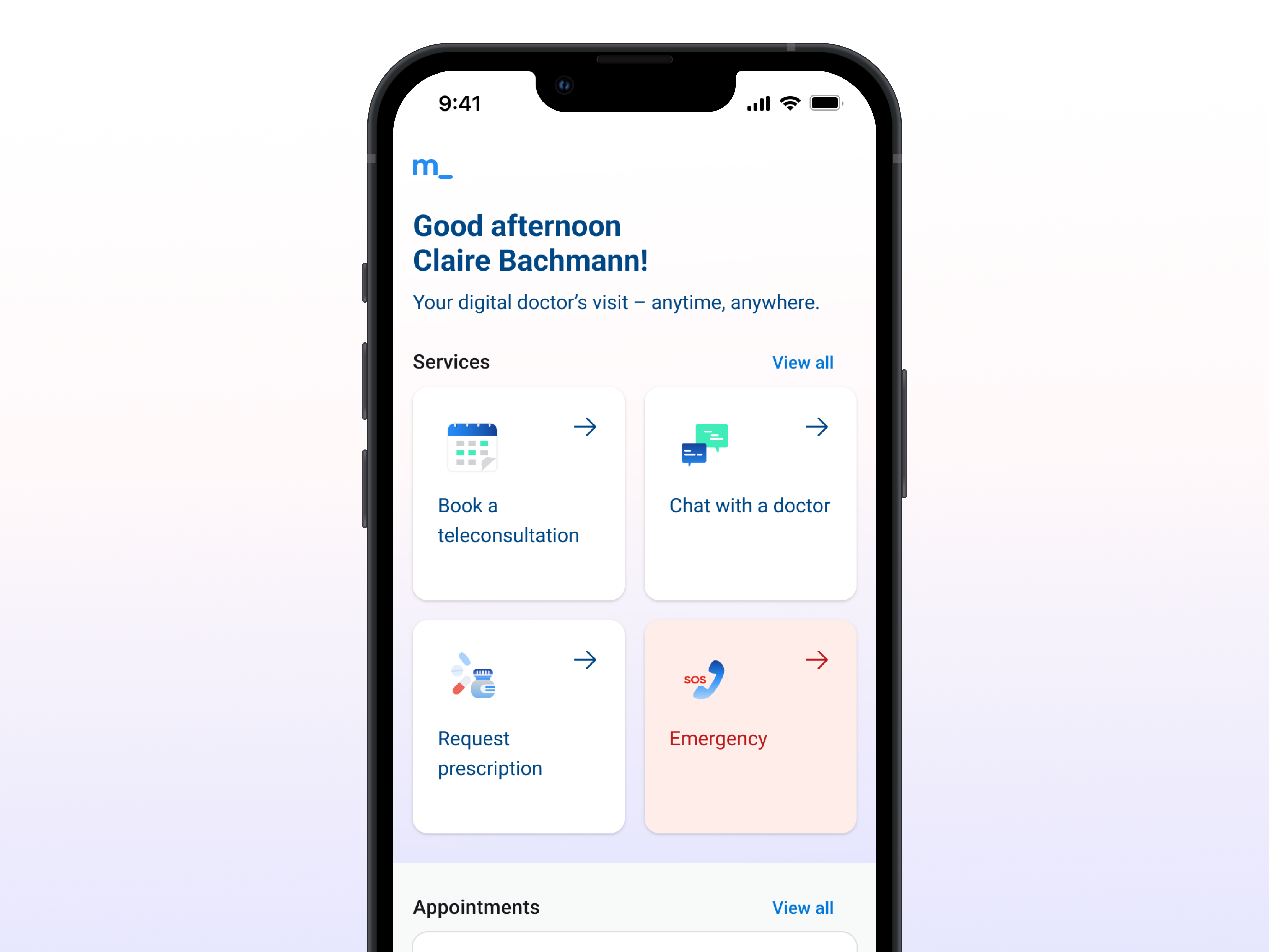
A home screen that adapts to the current context of the user

The redesign of the app's home screen marked our first significant overhaul. Formerly lacking a clear visual hierarchy and failing to guide users on forthcoming steps, we addressed these shortcomings through several key alterations.

  • Giving room to what matters at the moment: Previously, upcoming appointments and ongoing chats were buried in a sliding "reminder" section, alongside less crucial information. Recognizing the impact of missed appointments and delayed chat responses on patients and Medgate's finances, we've now given dedicated sections to these crucial aspects, ensuring they occupy prominent space on the screen.
  • Clear Call-to-Actions: We've enhanced call-to-actions with shadows and arrows while maintaining a classic blog-like layout for content. This distinction helps users quickly identify and respond to interactive prompts, improving engagement and navigation.
  • Enhanced Accessibility: In our commitment to improving accessibility, we've removed any interactive elements or text superimposed on photographs.

More to come...

Optimizing desk capacity in the hybrid workplace

The COVID-19 pandemic has undeniably transformed the workplace landscape, ushering in an era of remote work and hybrid office arrangements. As organizations adapt to this new reality, the need for efficient workspace management tools has become paramount. This is where my Microsoft Teams app, 'Places' steps in.

Client
ti&m AG

Year
Juli 2020

Role & team
Leading designer, working with a junior designer, PO and software engineers

Beyond Empty Desks: Maximizing Workspace Efficiency

In the wake of the COVID-19 pandemic, a paradigm shift swept across the corporate landscape, as organizations embraced remote work arrangements, offering employees the flexibility to work from home for a portion of the week. However, this transition posed a unique challenge: how to effectively manage office space in an era of fluctuating occupancy. ti&m AG recognized this challenge as an opportunity to develop the Microsoft application "Places" that empowers organizations to optimize their workspace utilization.

Designing a new product in an agile environment

Operating as a startup venture within ti&m AG, the 'Places' team adopted an agile approach, releasing an initial MVP and subsequently embracing a continuous delivery model. This ensured a steady stream of new features and enhancements, keeping the app in sync with evolving user needs.

As the leading designer embedded within the team of engineers, my responsibilities encompassed establishing a cohesive design language, crafting a comprehensive design system, conducting user research, providing guidance and mentorship to the junior designer on the team and managing the abundance of feature ideas from the passionate product owner.

Book your favourite spot in the office

In a sea of workstations, 'Places' is guiding employees towards their ideal workplace. Based on past booking patterns, accessibility requirements, and team affiliations, 'Places' suggests workspaces tailored to individual needs. A touch of playfulness is added by highlighting the most popular desk, sparking curiosity and encouraging employees to explore different workspace options.

Tailored for diverse workspace realities

In order to offer a competitive solution, 'Places' distinguishes itself with its adaptability and customization capabilities, catering to the unique needs of various workspace realities. Employers can tailor the booking options to suit their specific requirements, enabling employees to reserve desks for a full day, choose from predefined time slots, or select a custom time frame based on their needs. Extending its versatility beyond workspaces, 'Places' also facilitates the management of parking spaces.

An easy-to-understand pension forecast

BLPK (Basellandschaftliche Pensionskasse) embarked on a project to revamp their client portal, with a primary focus on enhancing user experience. At the heart of the portal lies a pension simulator, designed to provide users with a clear and insightful projection of their second-pillar pension earnings. This transformation aims to help individuals better understand the financial aspect of their retirement, thereby ensuring a more informed and secure future.

Client
BLPK

Year
Juli 2020

Role & team
Designer and project manager, working with the client and their brand agency

How might we make a dry but important topic more engaging?

Complicated rules and exceptional cases make it almost impossible for laypersons to understand how they can optimize their pension funds. The subject of retirement provision is often postponed, and most people deal with it too late.

To address this challenge, the project sought to define what is desirable, viable, and feasible. After the kick-off workshop, I created user stories. Some of the ideas from the workshop turned out to be too difficult to implement within a realistic budget.

The current state of your pension always on display

The new customer portal offers users a continuous snapshot of their current pension status, accompanied by a user-friendly pension forecast. Moreover, users can access and review saved pension simulations, as well as create additional scenarios for a more comprehensive and informed perspective.

Dynamic pension simulation for informed planning

Within the real-time pension simulator, users can explore diverse future scenarios, gaining valuable insights into the potential impact of adjustments like salary changes or early retirement decisions on their projected funds.

Remote financial advice for the modern bank

The landscape of business interactions was transformed by the Covid-19 pandemic. Talking to a relationship manager remotely has become a service that people expect. In response to this evolving need, Migros Bank has taken the initiative to provide its customers with the option to receive financial advice through video calls.

Client
Migros Bank

Year
Juli 2020

Role & team
Designer, working with a project manager and a developer

Creating a seamless user experience in a remote setting

The concept of a remote financial advice service had been lingering in the pipeline for some time. However, with the onset of the COVID-19 pandemic, the project's urgency was heightened, demanding swift implementation. Thanks our compact project team, consisting of a project manager, a developer and me as a designer, we were able to implement solution quickly.

A seamless user experience thanks to the attention to detail

Creating a user interface to start a video call might not seem very complex. However, there are many possible dead ends, if the UI is not designed carefully. We had to consider things like access rights procedures for different browsers, video formats sent by Skype for Business and the design of confirmation emails.

Breaking down information silos in electronic health records

Nurses and physicians rely heavily on the electronic medical record (EMR) as their central hub for patient information. However, crucial patient data often gets lost in a maze of disparate forms, hindering the seamless exchange of information across hospital departments. How can we redesign medical record applications to enhance information flow, minimize redundant documentation, and improve overall efficiency?

Year
August 2018 – July 2019

Role & team
Leading designer, working with POs, software developers and various hospital stakeholders

Unveiling hidden insights through a user-centric approach

Previously, software projects at the hospital were often initiated without the benefit of field research. Requirements were typically gathered through extended meetings between developers and user representatives, potentially overlooking the intricacies of real-world usage." Fortunately, this time we were granted the opportunity to observe individuals in their workplace and conduct in-depth interviews, unveiling valuable insights that would have otherwise remained hidden.

Our findings revealed several key areas for improvement:

  • Software designed for silos: Crucial patient information was often trapped within individual departments or professional groups, hindering effective collaboration and patient care.
  • Unstructured data dilemma: Doctors' tendency to dictate or write medical information in lengthy paragraphs made it challenging to extract and reuse specific data points, limiting the potential for data-driven insights.
  • Patient Exclusion from Medical Records: Elderly patients, in particular, faced difficulties in managing their medical information and keeping track of appointments.

A user journey map showing pain points a patient might experience when visiting the hospital.

A user journey map visualising inefficient steps in the workflow of a secretary.

Building less but better

Any staff member of the Hôpital du Valais had the possibility to request the development of new forms for the EMR. This led to an overwhelming backlog and a proliferation of forms (over 900), each catering only to a limited user group. To address this inefficiency, I undertook a comprehensive mapping of existing forms, identifying those with overlapping functionalities that could be consolidated into a single, unified web application.

Unlocking data's potential with FHIR

The current forms require doctors and nurses to input the same data multiple times. Simultaneously, this valuable data remains underutilized, lacking integration into broader contexts, statistical analyses, or automated summaries. To address this inefficiency, we embraced the FHIR framework, enabling us to establish meaningful relationships between disparate data points within patient medical records. For instance, if a transfusion reaction is documented on the transfusion form, it could be automatically displayed as a "Complication" on the problem list.

Establishing consistent rules and interaction patterns to ease cognitive load

To achieve a quick win with a potentially significant impact on medical staff productivity, I standardized the presentation of recurring information. This involved creating a consistent layout featuring a header section for page-related tasks such as 'print' and 'help,' and a sidebar displaying critical patient information like 'allergies' and 'reanimation status', that had to be visible at all times.

The decision to adopt Google Material Design and Angular Material as our framework was a pragmatic one, driven by Material Design's inherent suitability for both desktop and touch interfaces, its widespread adoption, and its ability to expedite the development process.

From a collection of digitized forms to modern software

This project paved the way for a pipeline of web applications that will be developed and implemented in a phased approach. The key improvements we achieved include:

  • Fewer applications for more users: By incorporating effective filtering, search functions, and improved UI design, we eliminated the need for separate forms catering to individual user groups. This consolidation fosters cross-disciplinary knowledge sharing and reduces redundant documentation.
  • Minimizing cognitive burden with standardized interaction design: Enabling users to locate recurring information effortlessly and consistently reduces frustration and accelerates onboarding for those transitioning to new roles within the hospital.
  • Unlocking data's value through meaningful connections: Repurposing data across different contexts amplifies the value of each data input and streamlines workflows, saving valuable time for healthcare professionals.
  • Empowering users with accessible help: Providing accessible information on application usage reduces reliance on IT support, freeing up resources for further product development and innovation.

'Hospital stay' gives a high-level overview over the patients encounters with the hospital. The card-based design allows to add modules for specific departments if needed.

The 'problem list' shows all of the patients conditions and is shared across departments. Drag and drop allows to quickly change the category of a problem.

A chronological feed of notes about a patient, that can be filtered and searched.

Interventions can be connected to conditions in order to avoid documenting the same information twice. An underlying catalogue automates steps of the billing process.

Introducing apps to clinical workflows

At the Hôpital du Valais, doctors and nurses rely on desktop computers or laptops on trolleys to access patient information and perform clinical tasks. However, the hospital had decided to run a pilot-project to understand how mobile phones could streamline processes and enhance communication.

Year
2018

Role & team
Leading designer, working with POs, software developers and various hospital stakeholders

Are mobile phones just gadgets or can they improve workflows?

Rather than replicating the entire medical record on a mobile device, we focused on utilizing unique mobile phone features like the camera, barcode scanner, and mobility to enhance specific workflows. This approach enabled us to develop a lean mobile application for a pilot project, offering a few shared devices on each floor that nurses could access when performing the targeted task.

Understanding nurses’ workflows

I had the chance to immerse myself in the daily routines of nurses for a week, I observed their tasks and engaged in insightful coffee break conversations. Some of the challenges I have observed:

  • Digital and non-digital task switching: Nurses often switch between digital and non-digital tasks, sometimes resorting to temporary paper notes due to time constraints or limited computer availability.
  • Inadequate hardware: Nurses rely on laptops on trolleys as their primary mobile devices. However, these trolleys are not designed for transporting medical supplies, forcing nurses to maneuver multiple trolleys and equipment, creating inefficiencies and hindering their mobility.
  • Task- instead of patient-based workflows: Workdays are organized by tasks rather than patients, resulting in nurses completing one task (e.g.: handing out medication) for all patients before moving to the next task.
  • Nurse-devised workarounds: To compensate for technology limitations, nurses print patient lists and take notes on paper throughout the day.

Streamlining the blood transfusion workflow with mobile technology

The blood transfusion process involves multiple identity checks, traditionally requiring two nurses to ensure patient safety. Additionally, space constraints at the patient's bedside and the need to maneuver two trolleys – one with equipment and one with a laptop for documentation – add to the complexity.

Our mobile app leverages barcode scanning to streamline identity checks, enabling a single nurse to quickly verify patient and blood product details, enhancing both speed and patient safety. The app also eliminates the need for a laptop trolley, reducing clutter and improving maneuverability.

The mobile app's design seamlessly aligns with the desktop application for blood transfusions, ensuring a consistent user experience.