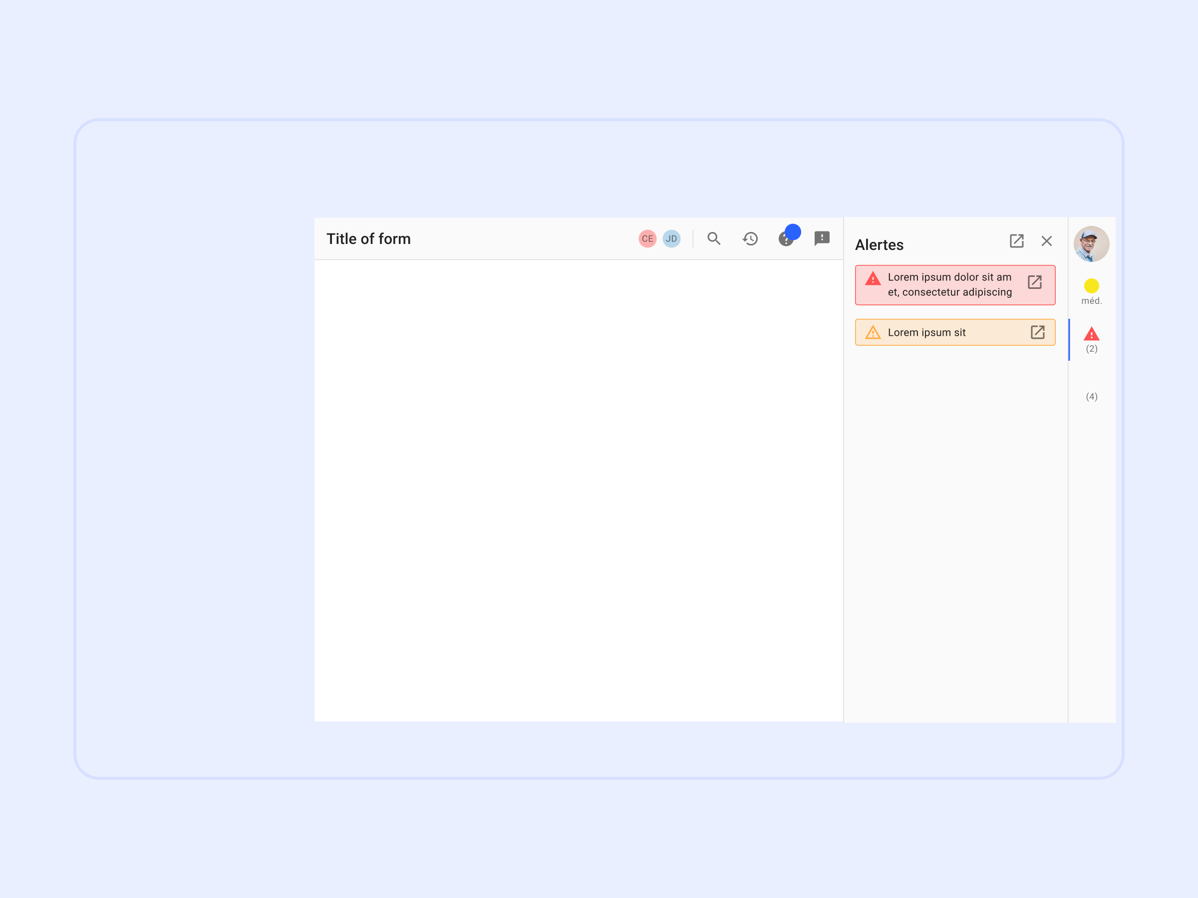
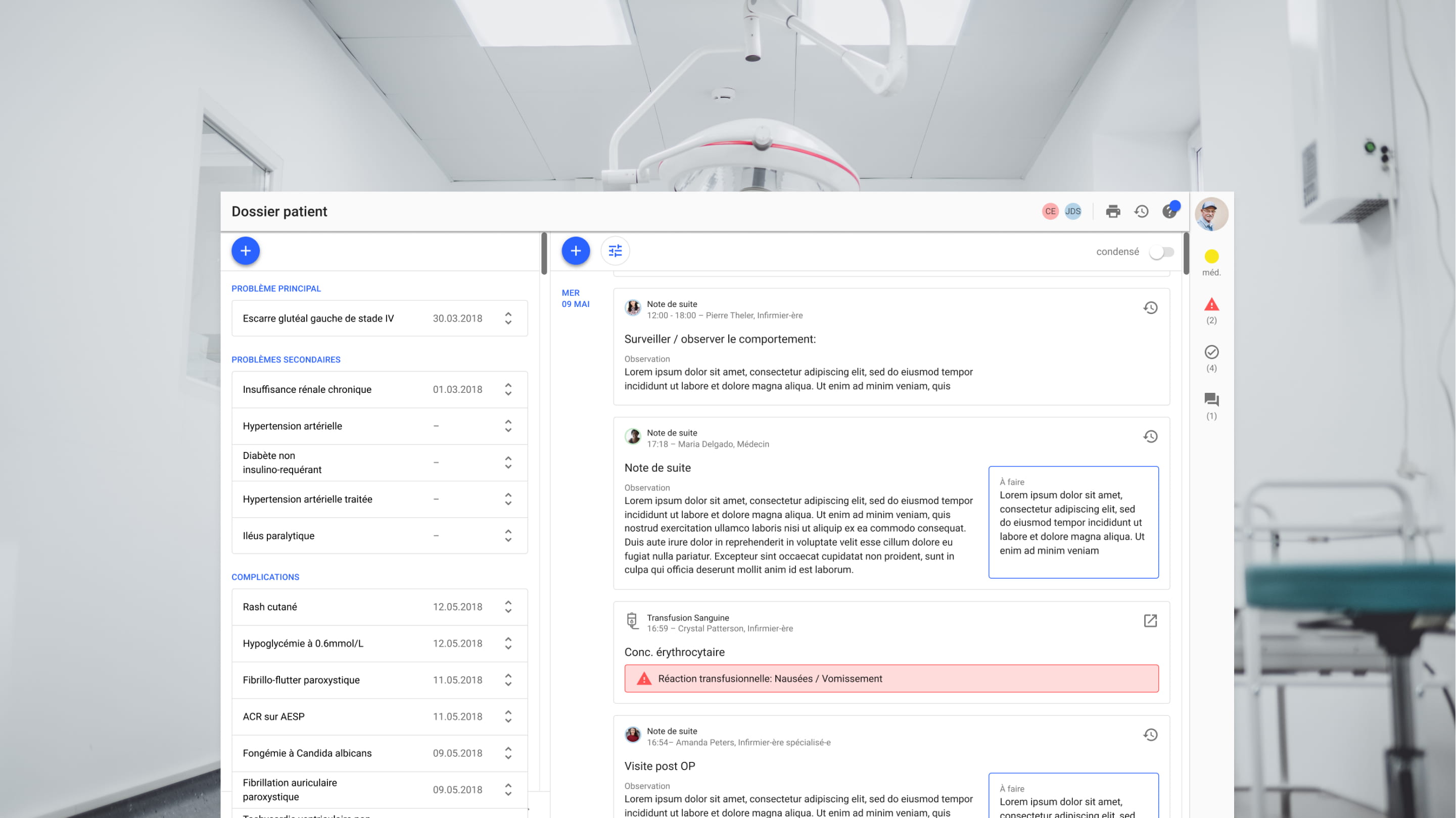
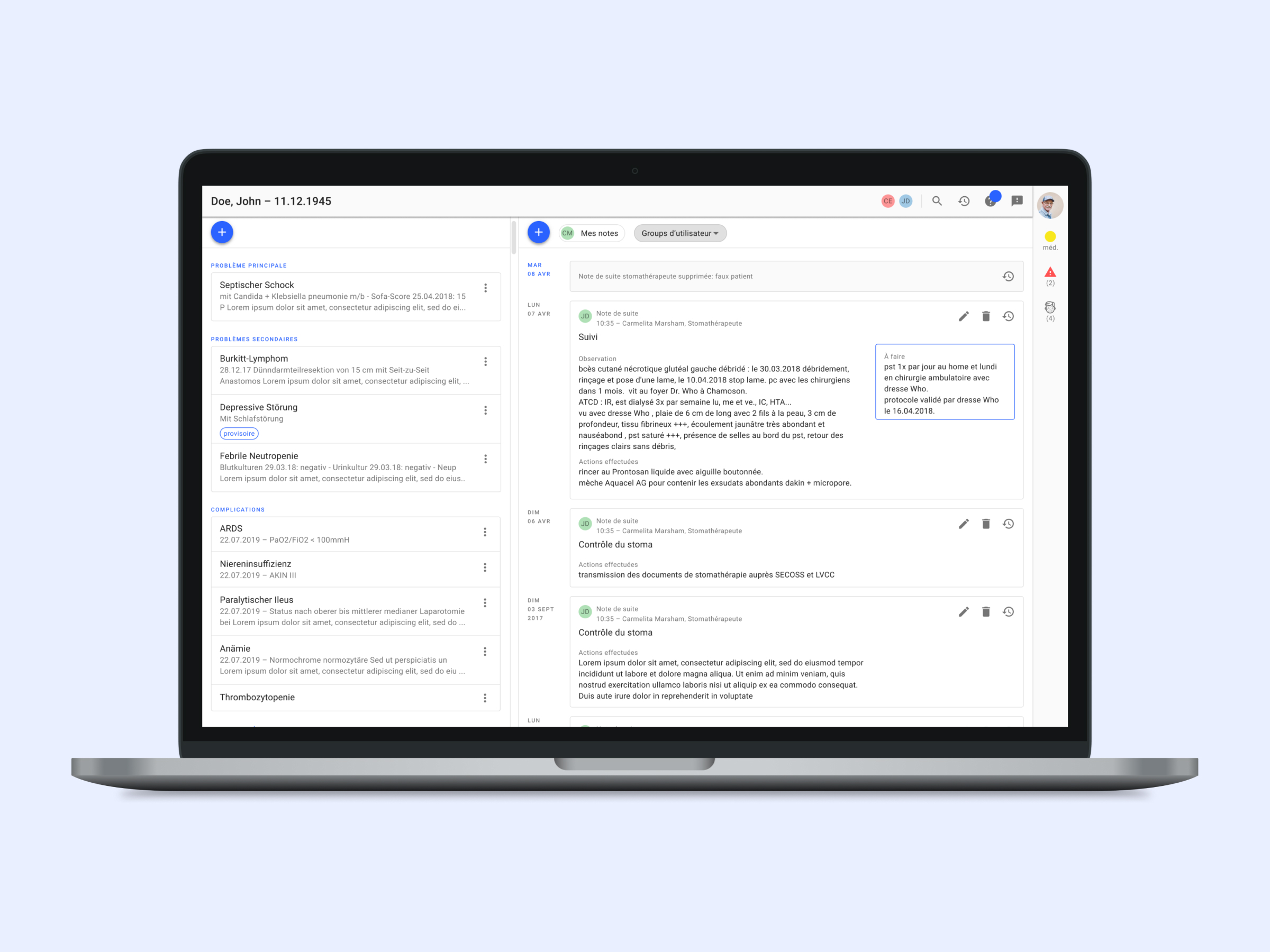
Simplifying electronic health records

The staff of the Hôpital du Valais works with a large number of different software on a daily basis. For the nurses and physicians, the main touchpoint is the electronic medical record (EMR). The EMR-software was purchased from an external vendor but offered the possibility to create custom forms with a form-builder. In addition to that, it was possible to plug web applications into the software. In March 2018 I joined the IT department as their first designer to help design these applications.

Responsibilities
Research
Information Architecture
UI Design
Management of Design System

Year
August 2018 – July 2019

Research

Understanding the problems before looking for a solution

So far there was no habit of field research at the hospital. Requirements for new software were usually defined in hour-long meetings between developers and user-representatives. This time luckily, we got permission to observe people at their workplace in addition to conducting interviews.

Findings

Software applications are designed for silos

Crucial patient information is not shared between different departments or professional groups.

Unstructured data makes it impossible to leverage information

Doctors have a habit of dictating or writing medical information in the form of long paragraphs, which makes it difficult to reuse specific parts of the data.

Patients are excluded from their medical records

Especially elderly patients are struggling with handling medical information as well as remembering doctors’ appointments.

A user journey map showing pain points a patient might experience when visiting the hospital.
A user journey map visualising inefficient steps in the workflow of a secretary.

Defining the scope

Understanding the difference between what users ask for and what they really need

Until this point, any staff member of the Hôpital du Valais could request the development of a new form. This process resulted in an unmanageable backlog and hundreds of forms each designed for only a small group of users. I mapped out all existing forms in order to discover which had overlapping functionalities that could be covered by one single web application.

Technological limitations and the lack of a product design process led to hundreds of forms.

Data standards

Getting more out of data thanks to the FHIR framework

The current forms oblige doctors and nurses to input the same data twice or even three times. At the same time the data is hardly ever re-used in different contexts, statistics or automated summaries.

We decided to work with FHIR because it would allow us to define relationships between different data points in the patients’ medical records. For example, if a transfusion reaction is documented on the transfusion form, it could be displayed automatically as a “Complication” on the problem list.

FHIR (Fast Healthcare Interoperability Resources) is a data standard for electronic health records.

Design system

Defining rules and interaction patterns to minimize cognitive load

Together with the developers, I decided to work with Google Material Design and Angular Material as a framework. Some of the reasons that supported this decision were that MD had been designed with desktop and touch use in mind, it’s very widely adopted and it would speed up the development process.

A quick-win which would potentially have a big impact on the productivity of the medical staff, was to standardize the way in which recuring information was displayed.

I created a layout with header, including page related tasks such as ‘print’ and ‘help’, and sidebar, hosting crucial patient information like ‘allergies’ and ‘reanimation status’.

The header contains recurring functionalities, like a help page and a modification history.
The sidebar contains the most important information about a patient and can be extended or closed depending on screen size.

The solution

A modern software rather than a collection of digitised forms

This project led to a pipeline of web applications, that will be developed and implemented gradually. The main improvements we achieved were:

Improvements

Fewer applications for more users

Thanks to filtering, search functions and better UI design there is no more need to have separate forms for each user group. Having different user groups use the same application reduces the need to double documentation and improves knowledge sharing among disciplines.

Interaction design standards to minimize cognitive burden

Allowing users to find information easily and always in the same place reduces frustration and onboarding time when changing jobs within the hospital.

Meaningful data connections

Reusing data in different contexts increases the value of a single data input and saves time.

Easy access to help

Allowing users to find information on how to use the applications cuts the need for IT support, which frees resources for further product development.

'Hospital stay' gives a high-level overview over the patients encounters with the hospital. The card-based design allows to add modules for specific departments if needed.
The 'problem list' shows all of the patients conditions and is shared across departments. Drag and drop allows to quickly change the category of a problem.
A chronological feed of notes about a patient, that can be filtered and searched.
A searchable table with all interventions a patient had during different stays at the hospital. Interventions can be connected to conditions in order to avoid documenting the same information twice. An underlying catalogue automates steps of the billing process.